Unattended video flow customization
Flow customizations
Features that allow you to customize flow characteristics in your onboarding process:
- Document types: The different types of identity documents that the process can support.
- Automatic quality detection: When a document is captured with MobbScan, the system automatically checks the image quality. If the quality isn't good enough, the user will be notified to take another capture.
- Document face detection: The system can automatically detect the face on the front of the document. If the face is not detected, the user will be notified to take another capture.
- Document review by user: You can specify whether the user is allowed to review the image of the captured document, being able to approve it or recapture it if it does not meet minimum quality standards.
- Face Quality detection: Enables the detection of the quality of the face captured by the user in terms of brightness, focus, and distance.
- Reattempts: Allow a number of retries for the document and/or facial validations.
- Timeout: Allow to specify the maximum total duration of the process (default 3 minutes).
Recording icon customization
In the unattended video flow there is a flashing icon that reminds the user that the entire process is being recorded.

The default text can be customized by language.
NOTE: Contact the support team to customize your onboarding process.
The following is a preview of each of the screens that are presented to the user during the unattended process, indicating in each one of them the elements that can be customized by the integrator client.
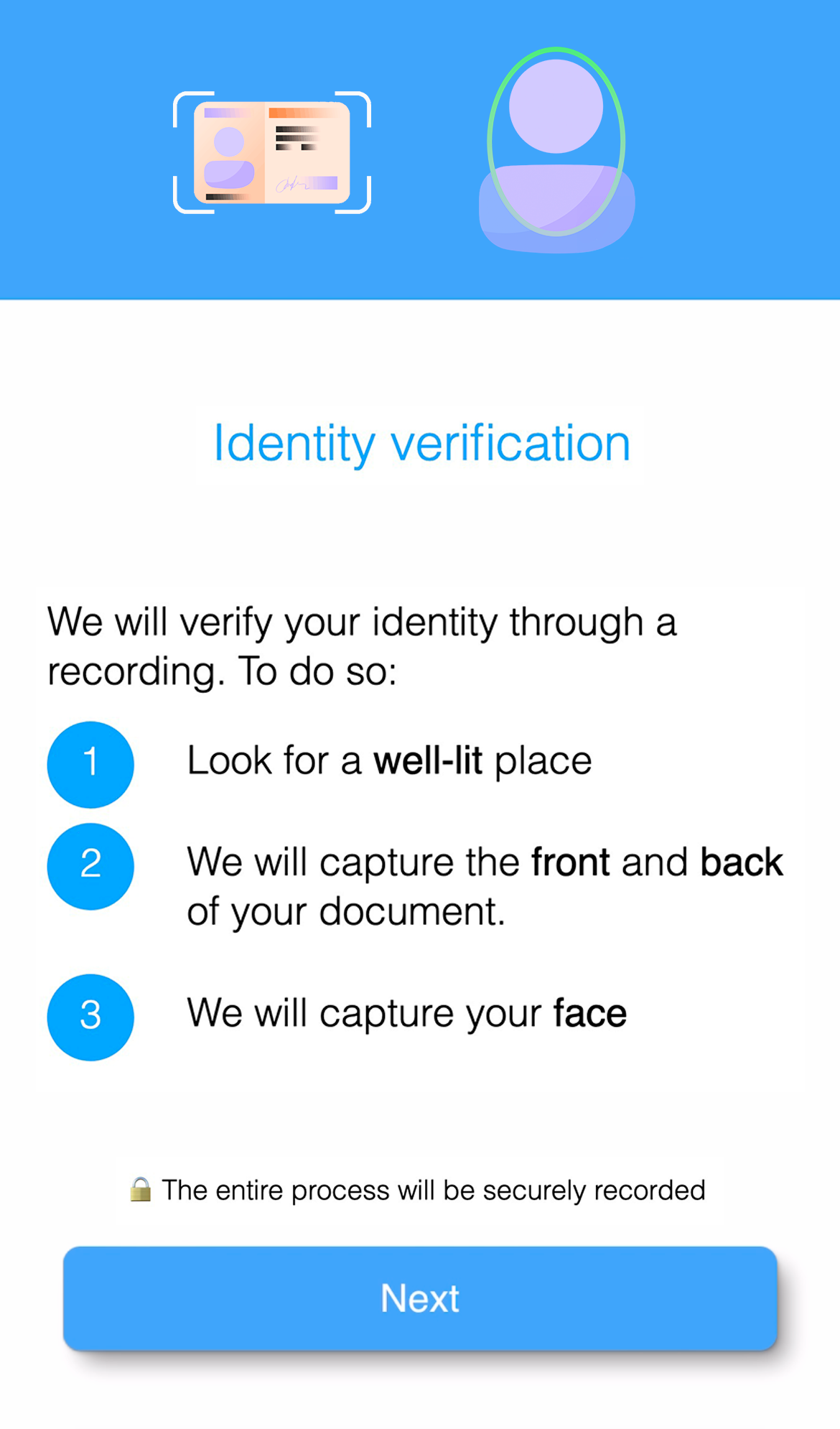
Process introduction screen
This screen is used to introduce the user to the process, and may warn or advise the user about some relevant aspect of the process. This section is completely optional and can be customized or disabled.
The customizations available for this screen are:
- Colors: Title and button (default blue), main text (default black), background (default white).
- Elements: Rounded corners of boxed elements such as buttons (default 8px).
- Fonts: You can use a custom font (default the system font), with a specific size and weight.
- Images: Main image (by default see capture).
- Texts: Main paragraph and button text (default see screenshot).
| Default styles | Custom styles |
|---|---|
 |
 |
NOTE: Contact the support team to customize your onboarding process.
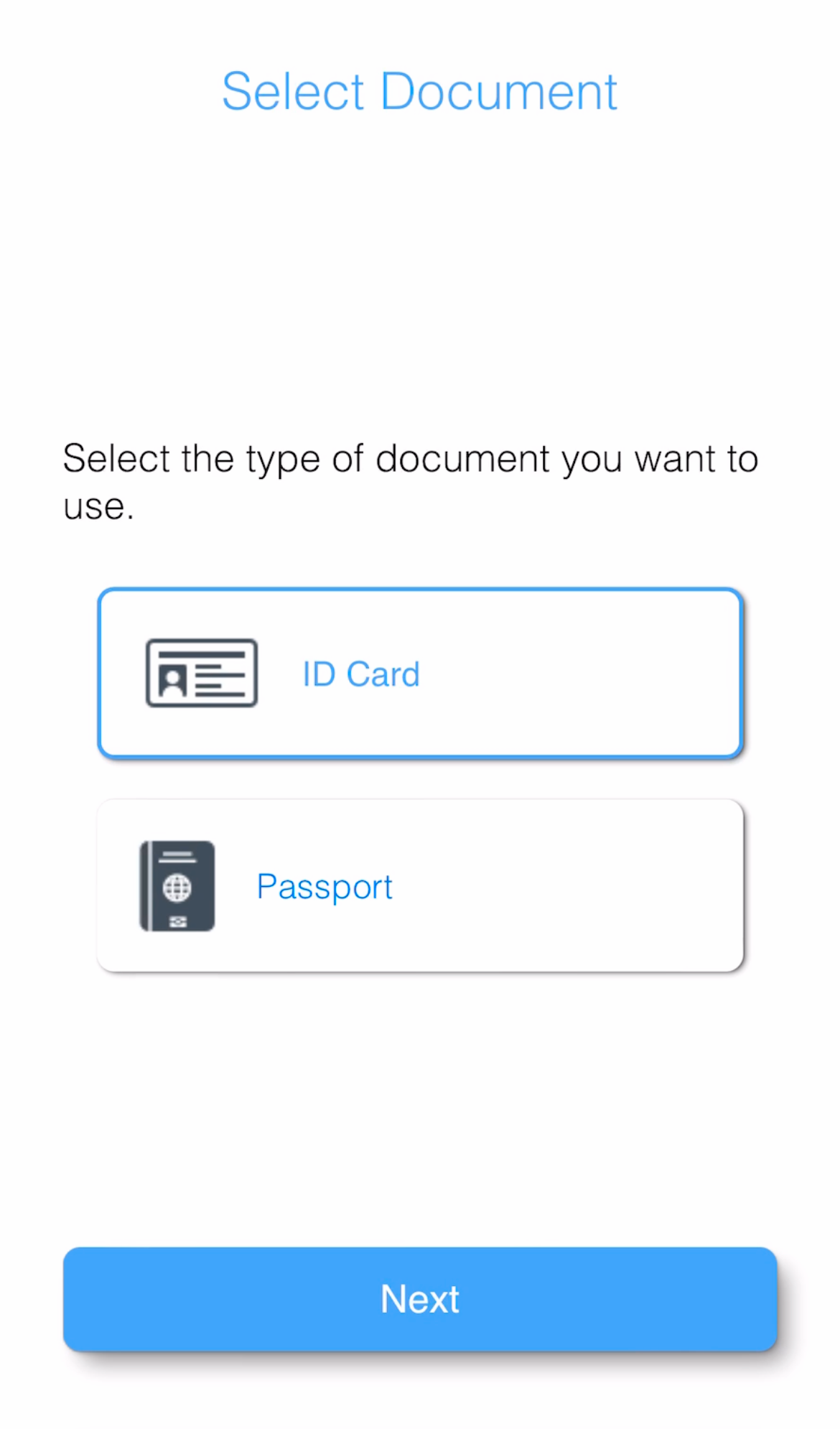
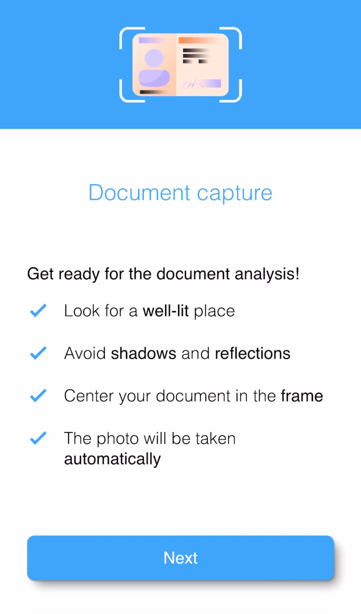
Document selection screen
This screen is used to allow the user to select a valid document type for process identification. This screen is optional, therefore it can be disabled.
The customizations available for this screen are:
- Colors: Title and button (default blue), main text (default black), background (default white).
- Elements: Rounded corners of boxed elements such as buttons (default 8px).
- Fonts: You can use a custom font (default the system font), with a specific size and weight.
- Images: Main image (by default see capture).
- Texts: Main paragraph and button text (default see screenshot).
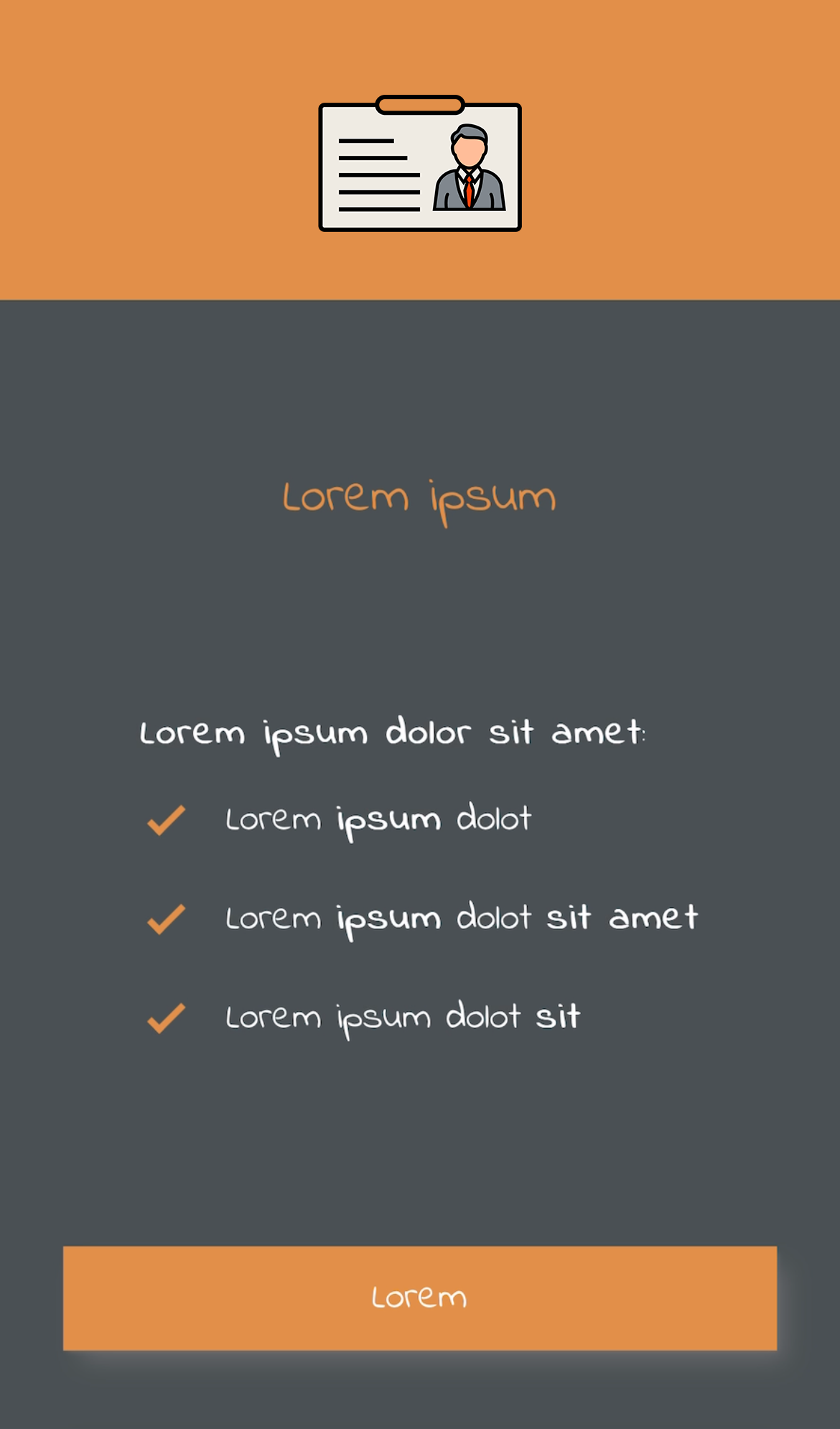
| Default styles | Custom styles |
|---|---|
 |
 |
NOTE: Contact the support team to customize your onboarding process.
Document introduction screen
This screen is used to introduce the user to the process, and may warn or advise the user about some relevant aspect of the process. This section is completely optional and can be customized or disabled.
The customizations available for this screen are:
- Colors: Title and button (default blue), main text (default black), background (default white).
- Elements: Rounded corners of boxed elements such as buttons (default 8px).
- Fonts: You can use a custom font (default the system font), with a specific size and weight.
- Images: Main image (by default see capture).
- Texts: Main paragraph and button text (default see screenshot).
| Default styles | Custom styles |
|---|---|
 |
 |
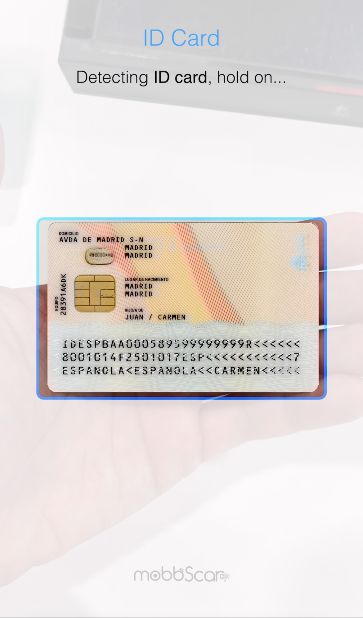
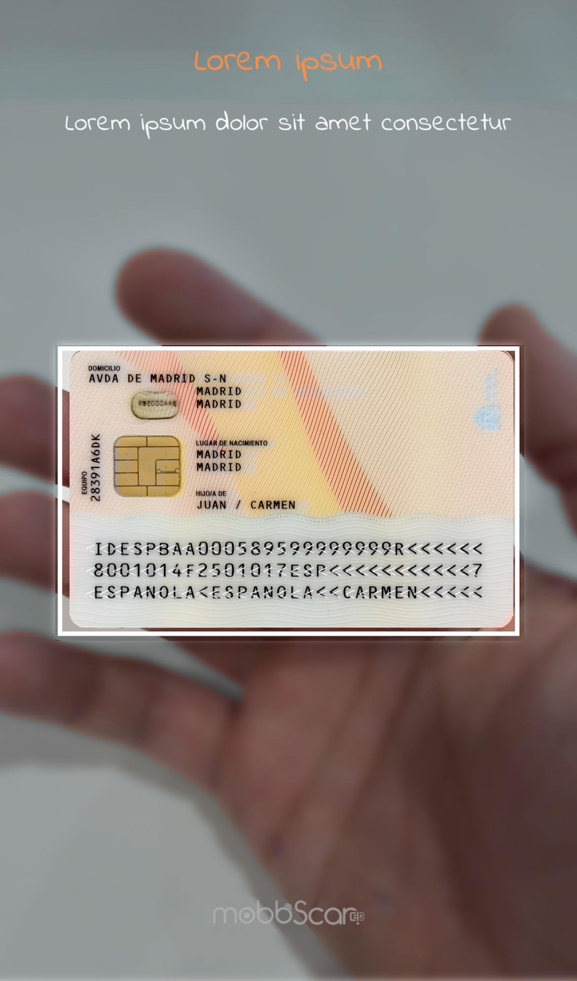
Document capture screen
This screen is used to perform the process of detecting and capturing the user's document, with the objective of favoring the correct execution of the process and an optimal user experience.
The customizations available for this screen are:
- Colors: Title and button (default blue), main text (default black), background (default white).
- Elements: Rounded corners of boxed elements such as buttons (default 8px).
- Fonts: You can use a custom font (default the system font), with a specific size and weight.
- Texts: User interaction messages and button texts (see screenshots by default).
Front document detection
This screen is used to perform the process of detecting and capturing the front side of the document.
| Default styles | Custom styles |
|---|---|
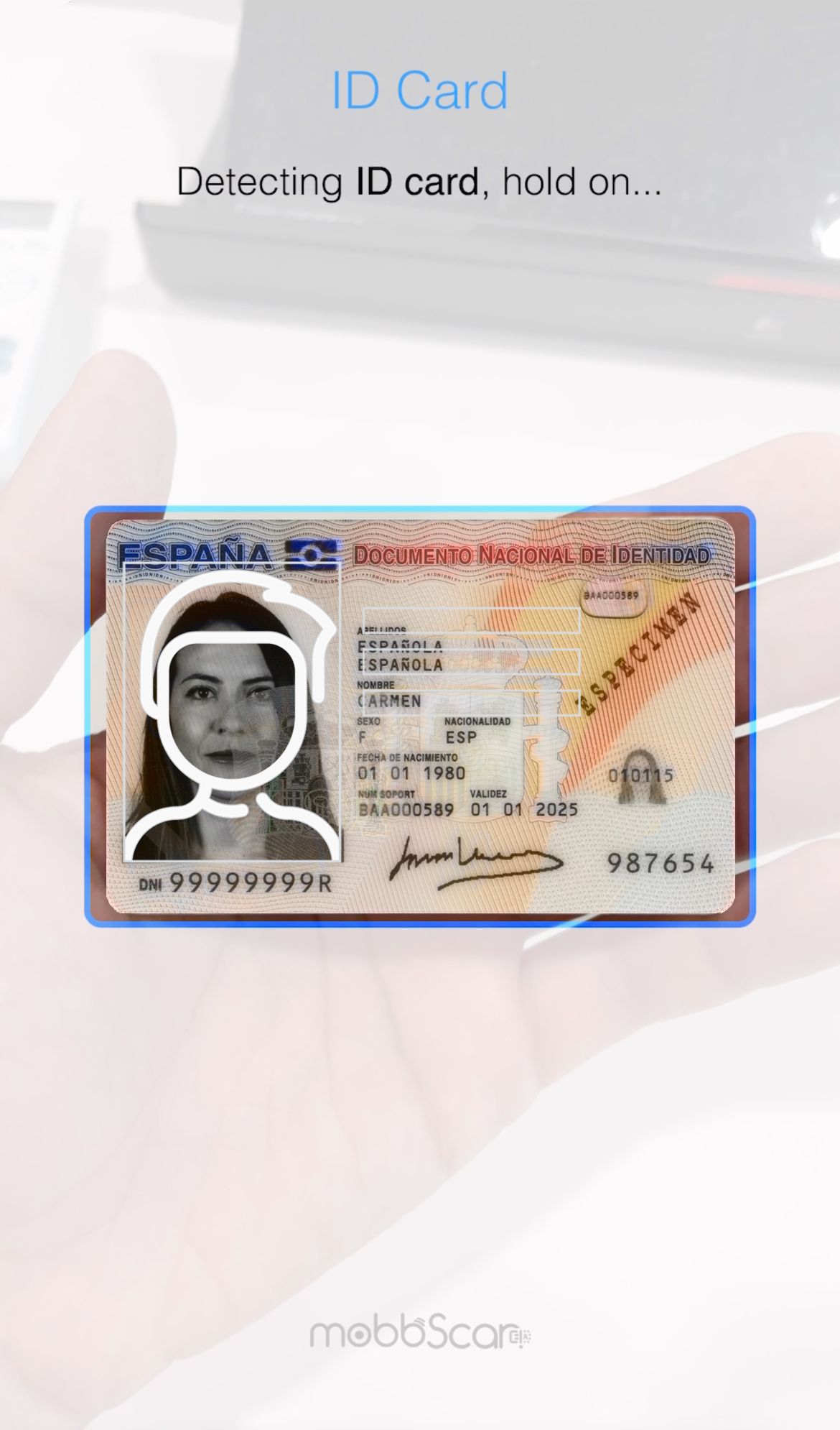 |
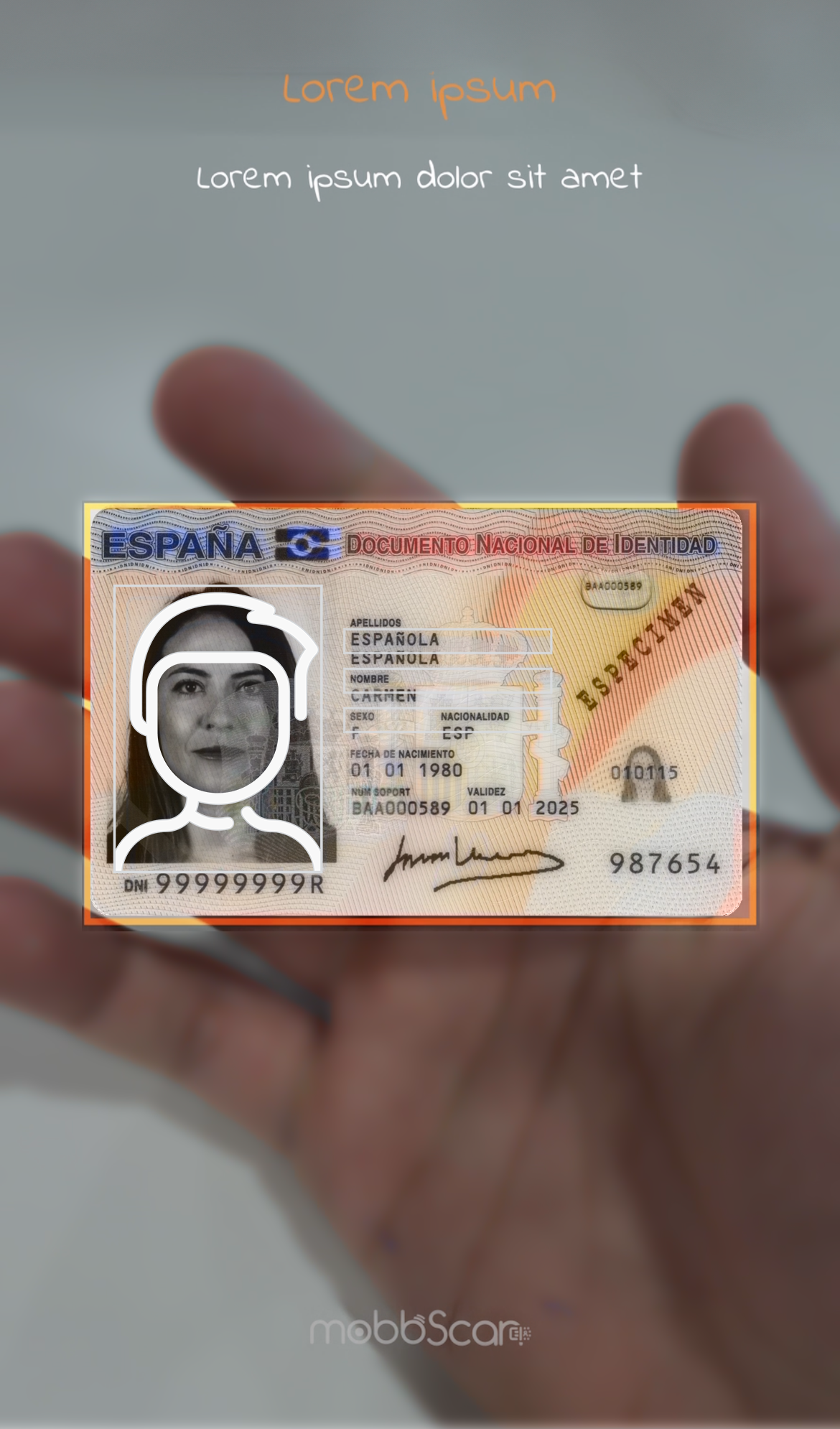 |
Back document detection
This screen is used to perform the process of detecting and capturing the back side of the document.
| Default styles | Custom styles |
|---|---|
 |
 |
NOTE: Contact the support team to customize your onboarding process.
Face introduction screen
This screen is used to introduce the user to the process, and may warn or advise the user about some relevant aspect of the process. This section is completely optional and can be customized or disabled.
The customizations available for this screen are:
- Colors: Title and button (default blue), main text (default black), background (default white).
- Elements: Rounded corners of boxed elements such as buttons (default 8px).
- Fonts: You can use a custom font (default the system font), with a specific size and weight.
- Images: Main image (by default see capture).
- Texts: Main paragraph and button text (default see screenshot).
| Default styles | Custom styles |
|---|---|
 |
 |
NOTE: Contact the support team to customize your onboarding process.
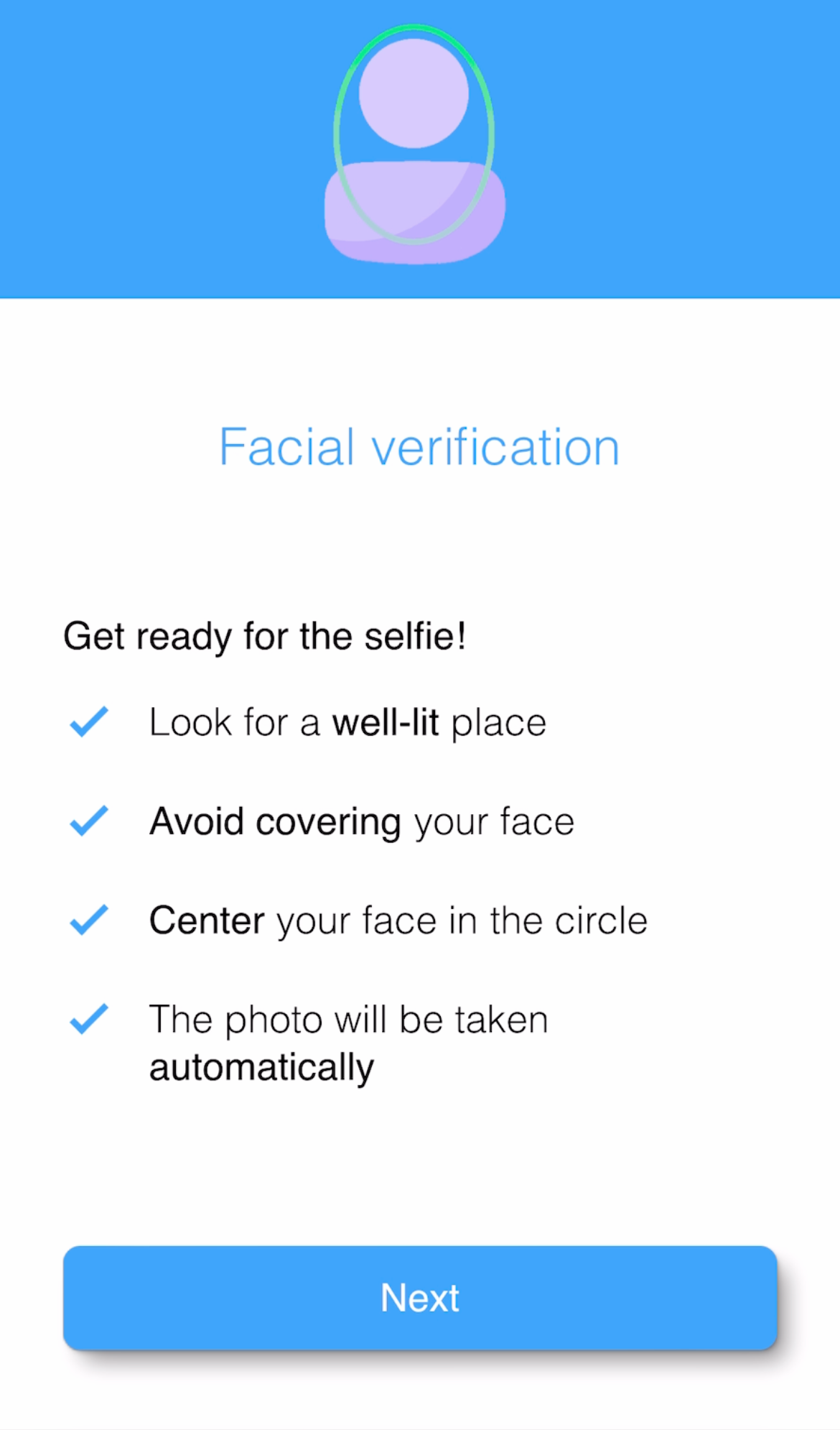
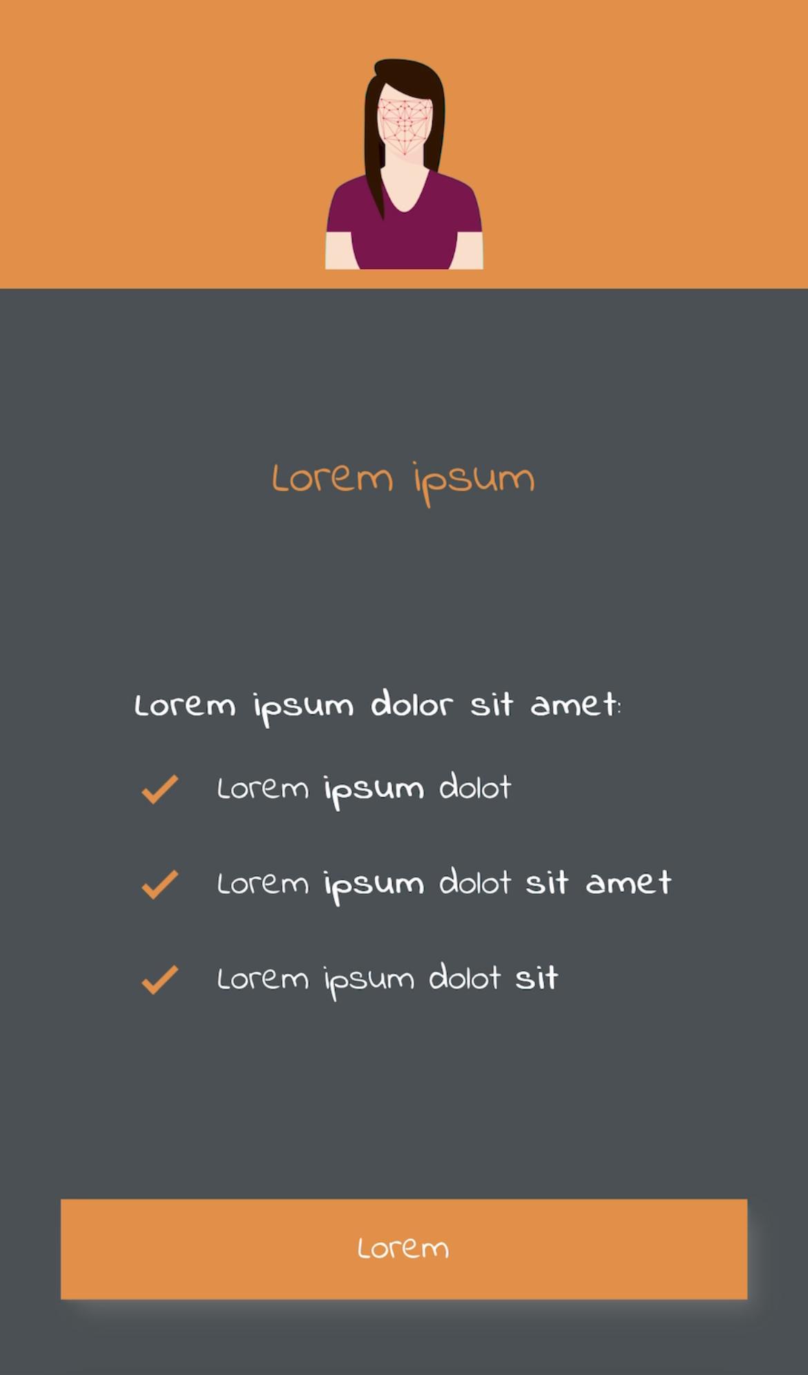
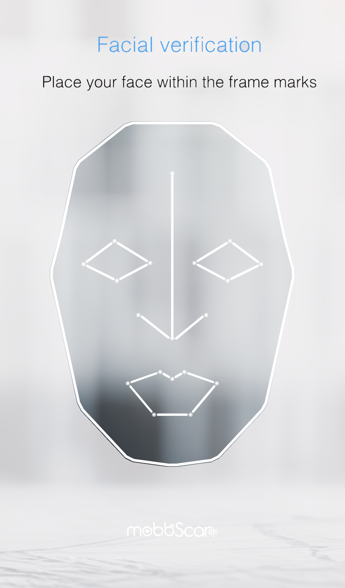
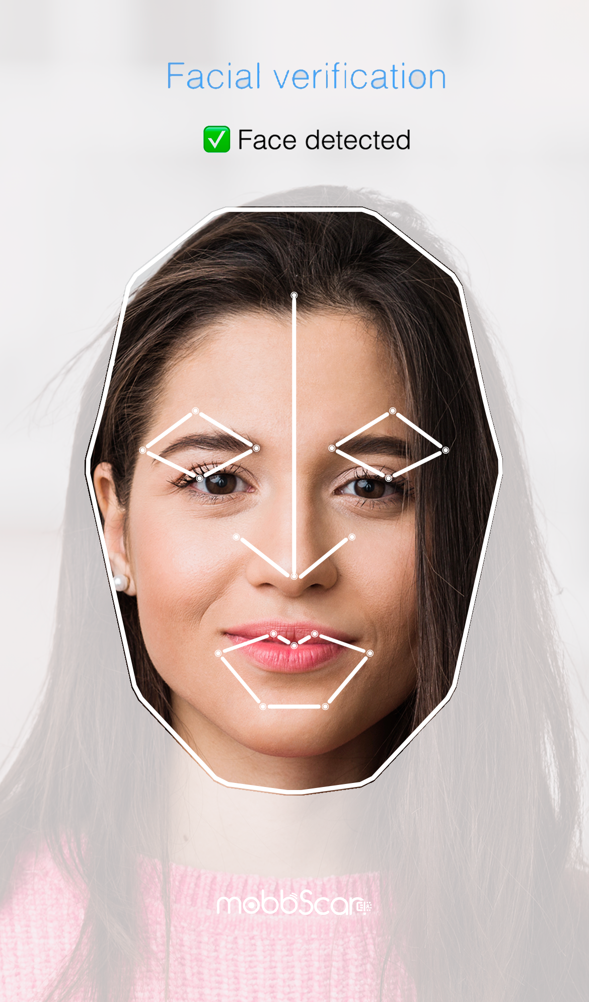
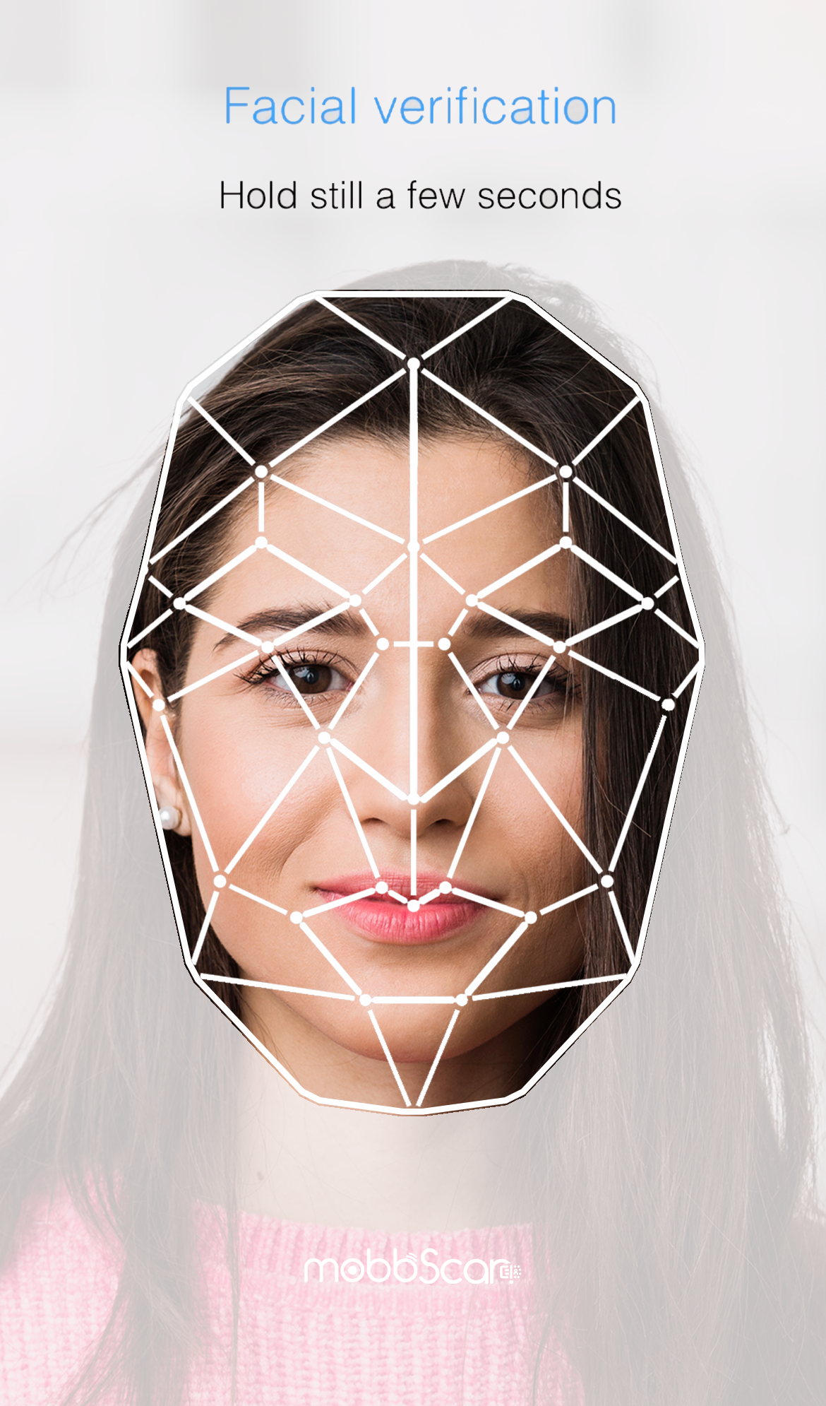
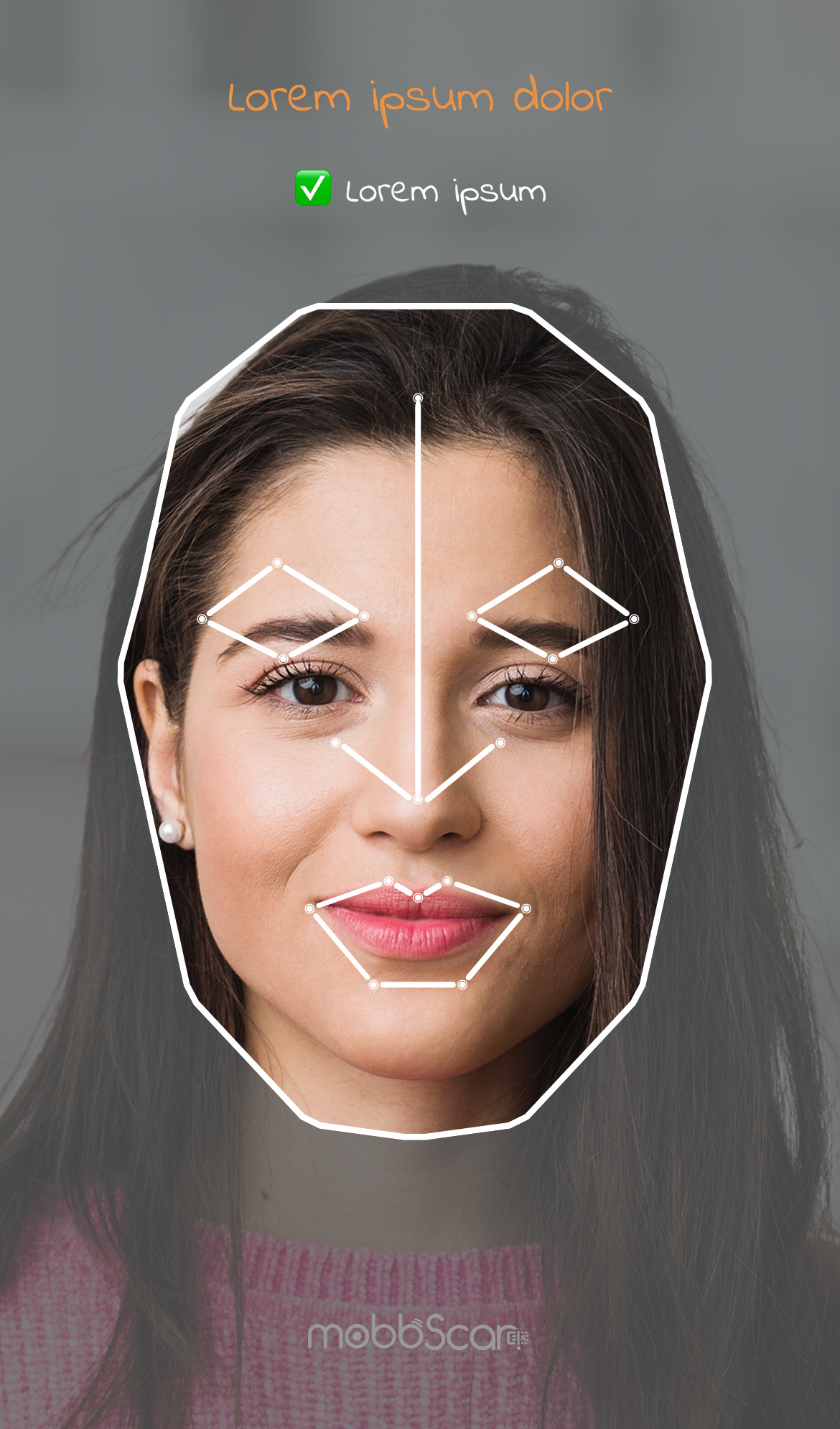
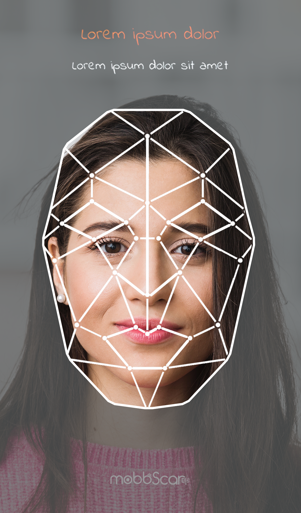
Face detection screen
This screen is used to perform the process of detecting and capturing the user's face, with the objective of favoring the correct execution of the process and an optimal user experience.
The customizations available for this screen are:
- Colors: Title and button (default blue), main text (default black), background (default white).
- Elements: Rounded corners of boxed elements such as buttons (default 8px).
- Fonts: You can use a custom font (default the system font), with a specific size and weight.
- Texts: User interaction messages and button texts (see screenshots by default).
| Default styles | ||
|---|---|---|
 |
 |
 |
| Custom styles | ||
|---|---|---|
 |
 |
 |
NOTE: Contact the support team to customize your onboarding process.