Face flow settings
This flow allows for the automatic identification of a person's identity by analyzing an image of their face.
Flow customizations
Features that allow you to customize flow characteristics in your onboarding process:
- Reattempts: Allow a number of retries for the facial validation.
- Face Quality detection: Enables the detection of the quality of the face captured by the user in terms of brightness, focus, and distance.
NOTE: Contact the support team to customize your onboarding process.
The following is a preview of each of the screens that are presented to the user during the facial detection and scanning process, indicating in each one of them the elements that can be customized by the integrator client.
Face introduction screen
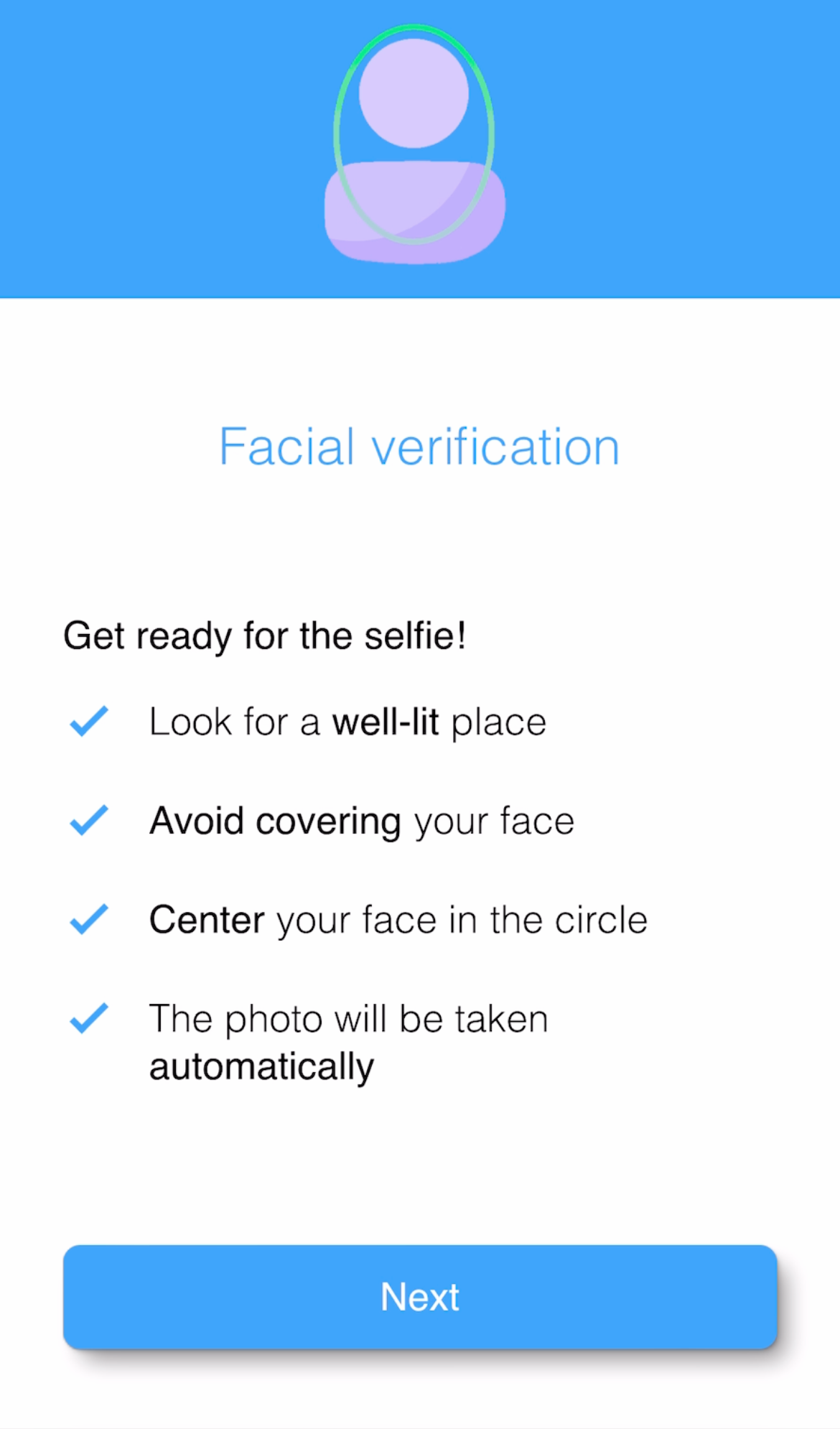
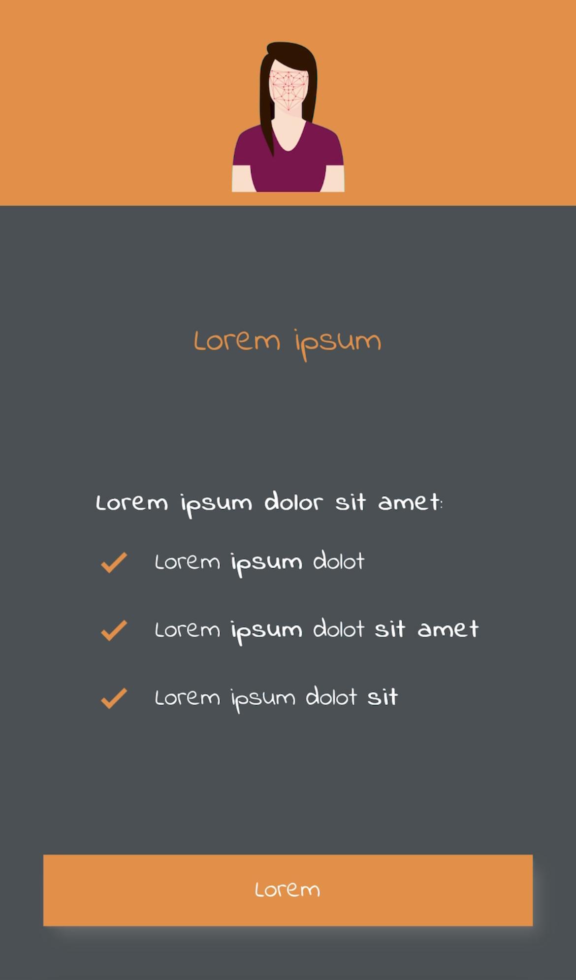
This screen is used to introduce the user to the process, and may warn or advise the user about some relevant aspect of the process. This section is completely optional and can be customized or disabled.
The customizations available for this screen are:
- Colors: Title and button (default blue), main text (default black), background (default white).
- Elements: Rounded corners of boxed elements such as buttons (default 8px).
- Fonts: You can use a custom font (default the system font), with a specific size and weight.
- Images: Main image (by default see capture).
- Texts: Main paragraph and button text (default see screenshot).
| Default styles | Custom styles |
|---|---|
 |
 |
NOTE: Contact the support team to customize your onboarding process.
Face detection screen
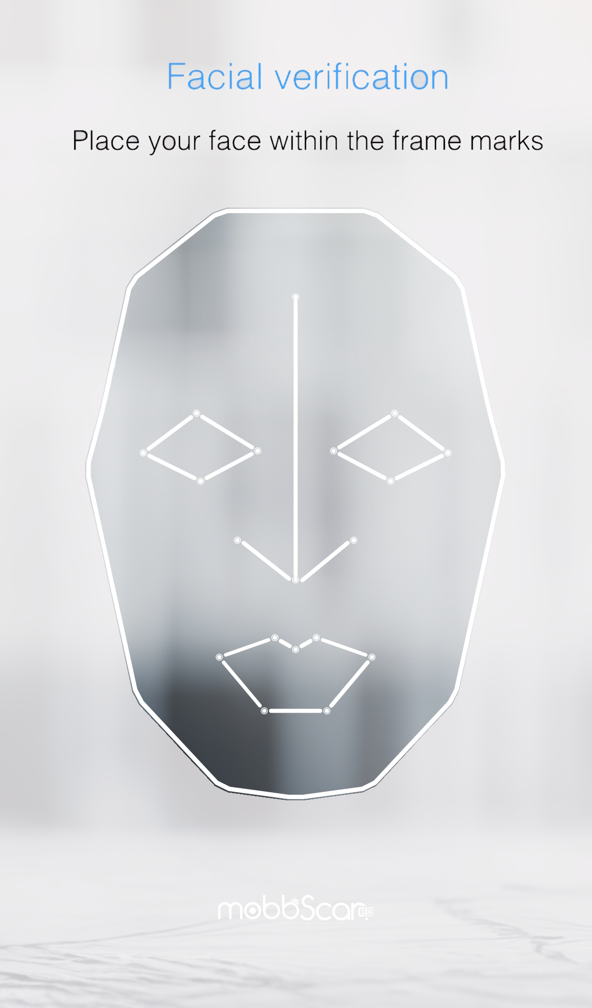
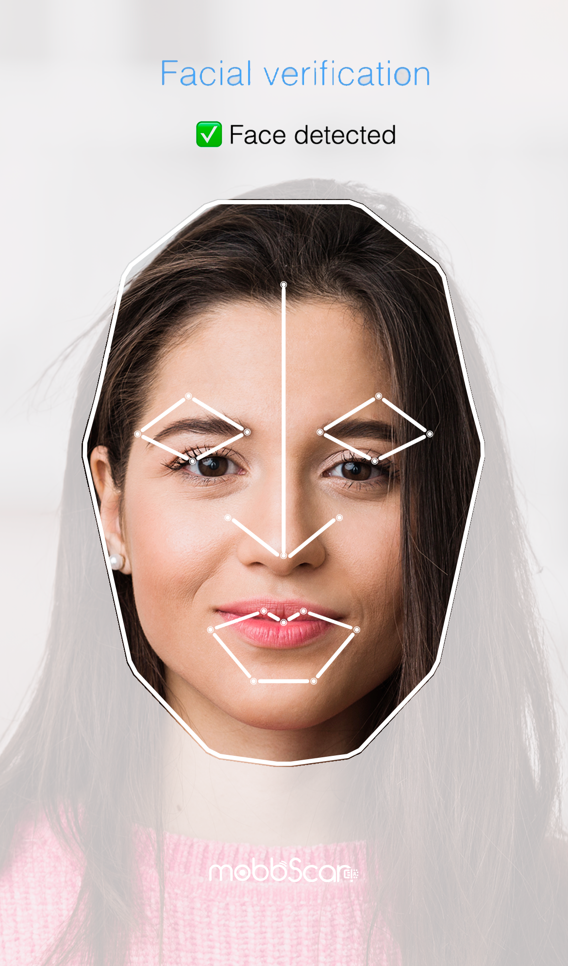
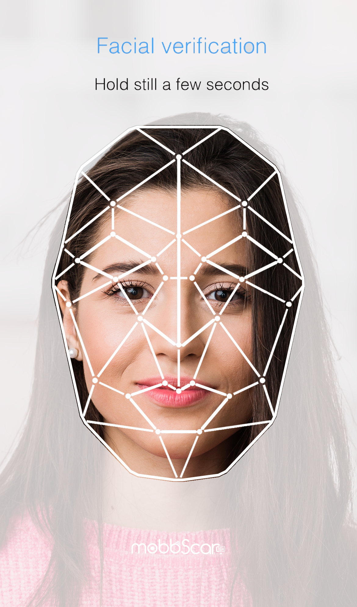
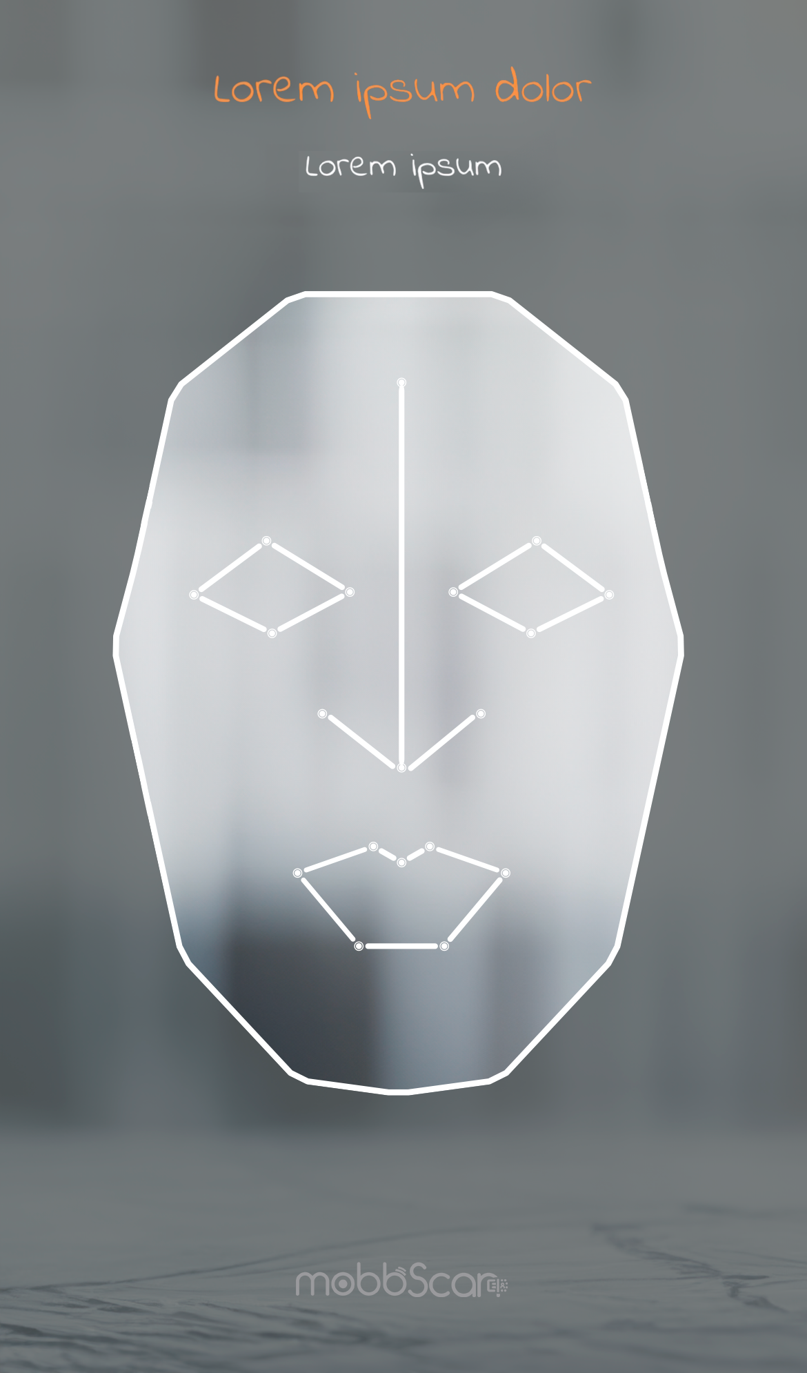
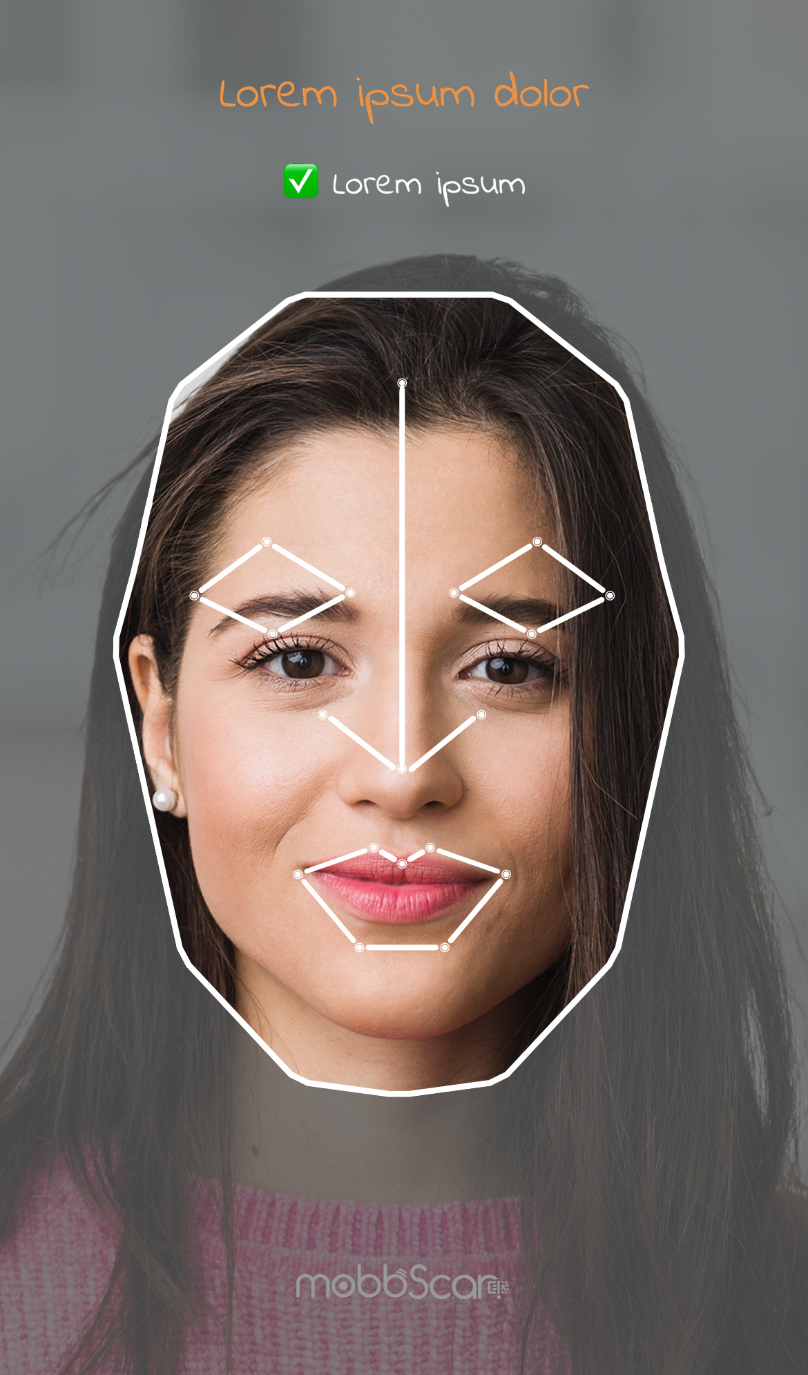
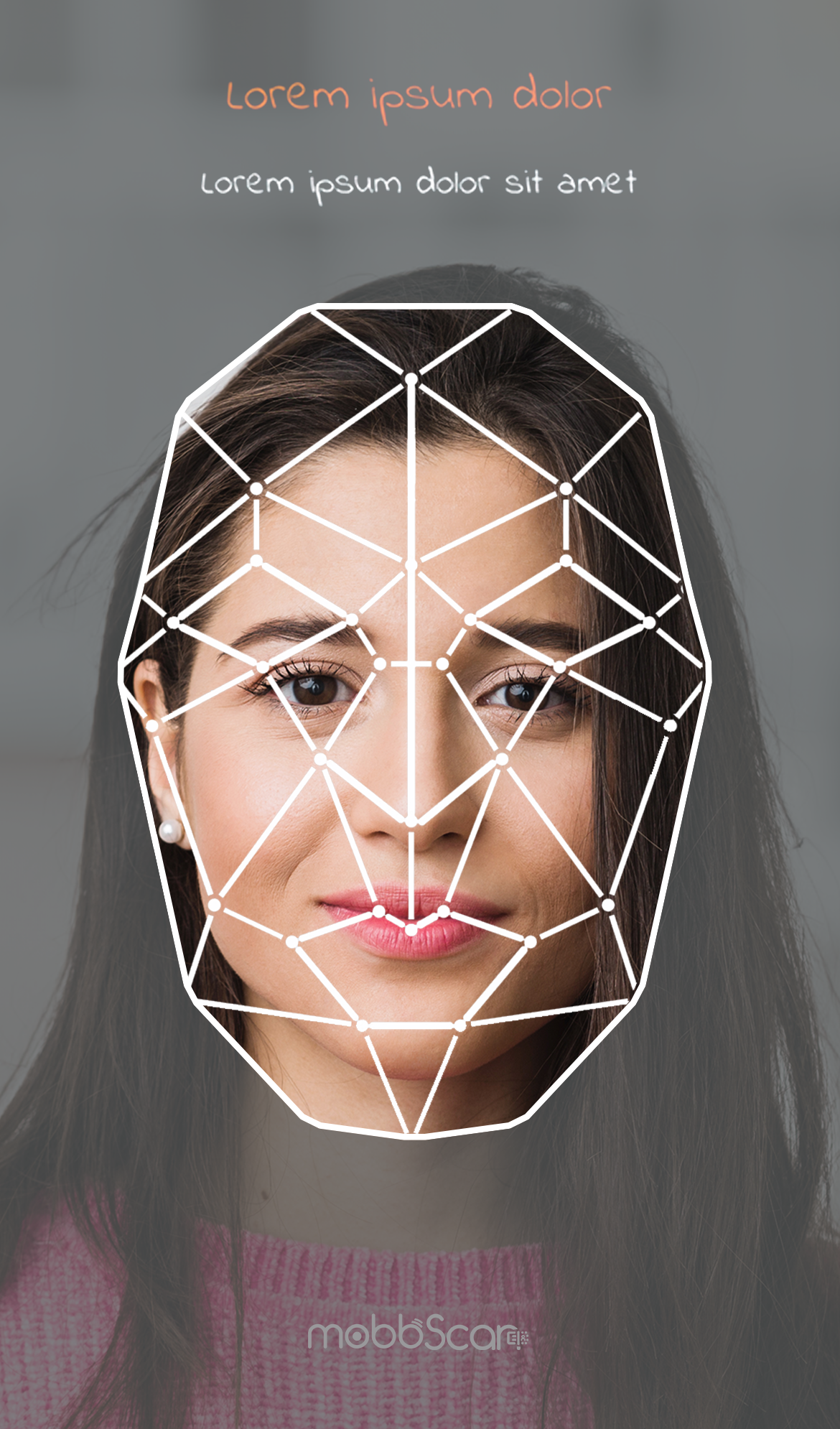
This screen is used to perform the process of detecting and capturing the user's face, with the objective of favoring the correct execution of the process and an optimal user experience.
The customizations available for this screen are:
- Colors: Title and button (default blue), main text (default black), background (default white).
- Elements: Rounded corners of boxed elements such as buttons (default 8px).
- Fonts: You can use a custom font (default the system font), with a specific size and weight.
- Landmarks: Face landmarks points (default see screenshot).
- Texts: User interaction messages and button texts (see screenshots by default).
| Default styles | ||
|---|---|---|
 |
 |
 |
| Custom styles | ||
|---|---|---|
 |
 |
 |
NOTE: Contact the support team to customize your onboarding process.
